Buttons block allows a smooth conversation experience, making it simple for users to take control. Every click presents you with the opportunity to customize your journey by picking one path or several and creating an engaging dialogue that suits all needs.
Buttons make bots come to life, providing an interactive experience for users when interacting with websites or social media accounts.
Different types of Buttons are:
- Branch - Move to a different path of the conversation flow.
- URL - Open a web page and end the flow.
Buttons will perform either of the above functions at a time.
Maximum number of buttons that can be added is 10.
The buttons do not disappear after they are clicked on so, the user can return them at any moment during a conversation.
Setting up the Buttons:
-
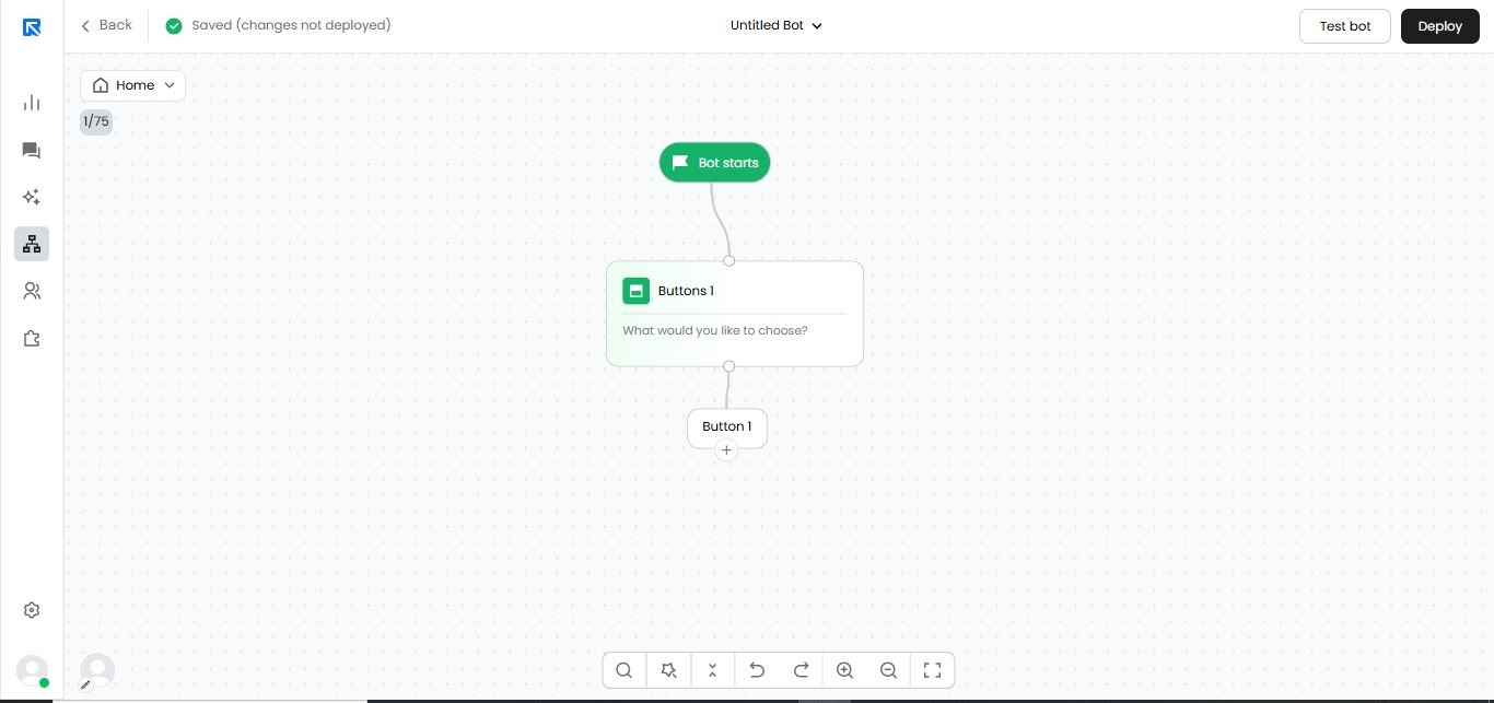
Add the action block on canvas by clicking ‘+’.
-
Search for the "Buttons" block.
-
Click on the 'Buttons 1' block to configure it.
-
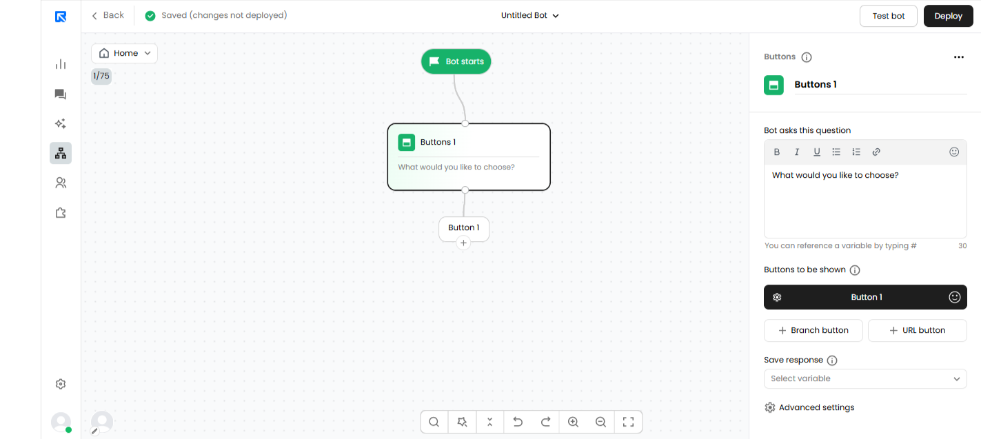
Defining Question:
Depending upon the preference, you can either add a text message or a question that needs to be sent to the visitor for collecting input.
Using our rich text editor, you can format the text or the question that you want to send to the user.
You can also add emojis to make the conversation more casual and friendly.
-
Defining buttons:
You can either add a Branch button or URL button based on your preference. Let’s have a quick look about how these buttons can be configured. -
Branch Button:
Selecting and configuring the branch button will allow the user to navigate visitors to different flows based on the selection. -
In-order to rename the button, you need to double click on it and give the appropriate name.
-
Adding extra buttons:
By clicking '+ Branch Button' multiple buttons will be added.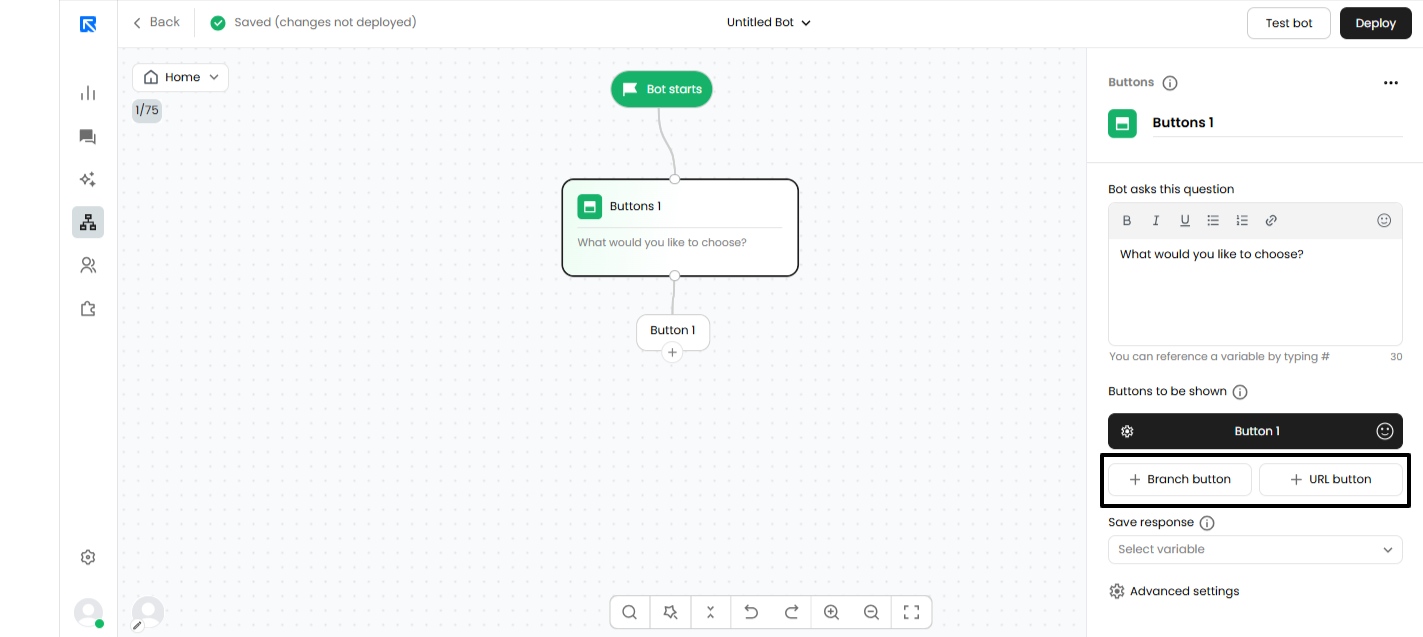
-
URL Button:
Adding a URL button will allow you to navigate your visitors from one page to another either in the same tab or in a different tab. You can add multiple URL buttons by clicking on '+ URL Button'.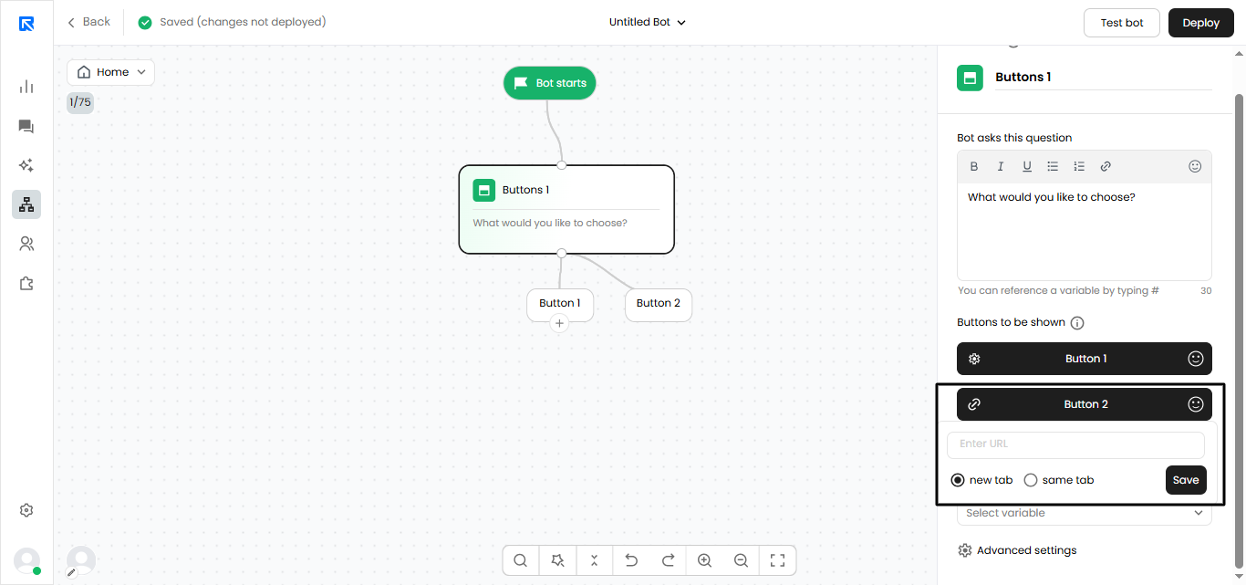
-
To configure the URL button, you can follow the steps below:
- Click on the 'Link Icon' displayed on the left of the button.
- Copy or Paste the Link / URL you want the visitor to be navigated to.
- There are two options where you want your webpage to open in a new tab or in the same tab.
- Click on tick button to set the website link in the URL button.
Some more features of Buttons:
To explore the advanced features of the Buttons block, click on Advanced Settings.
Search:
When enabled, a search box appears above the list of buttons, allowing users to quickly locate their desired option.
This feature is particularly useful for managing extensive lists of buttons.
Multi Select:
This feature enables users to select multiple buttons simultaneously. Once the necessary buttons are chosen, users can proceed to the next step in the chat flow by clicking 'Send'.
When multi-select is used, the flow will consistently proceed to the 'Default' branch.
When employing variables for multi-select, all values will be saved in a comma-separated format, such as 'small, medium'.
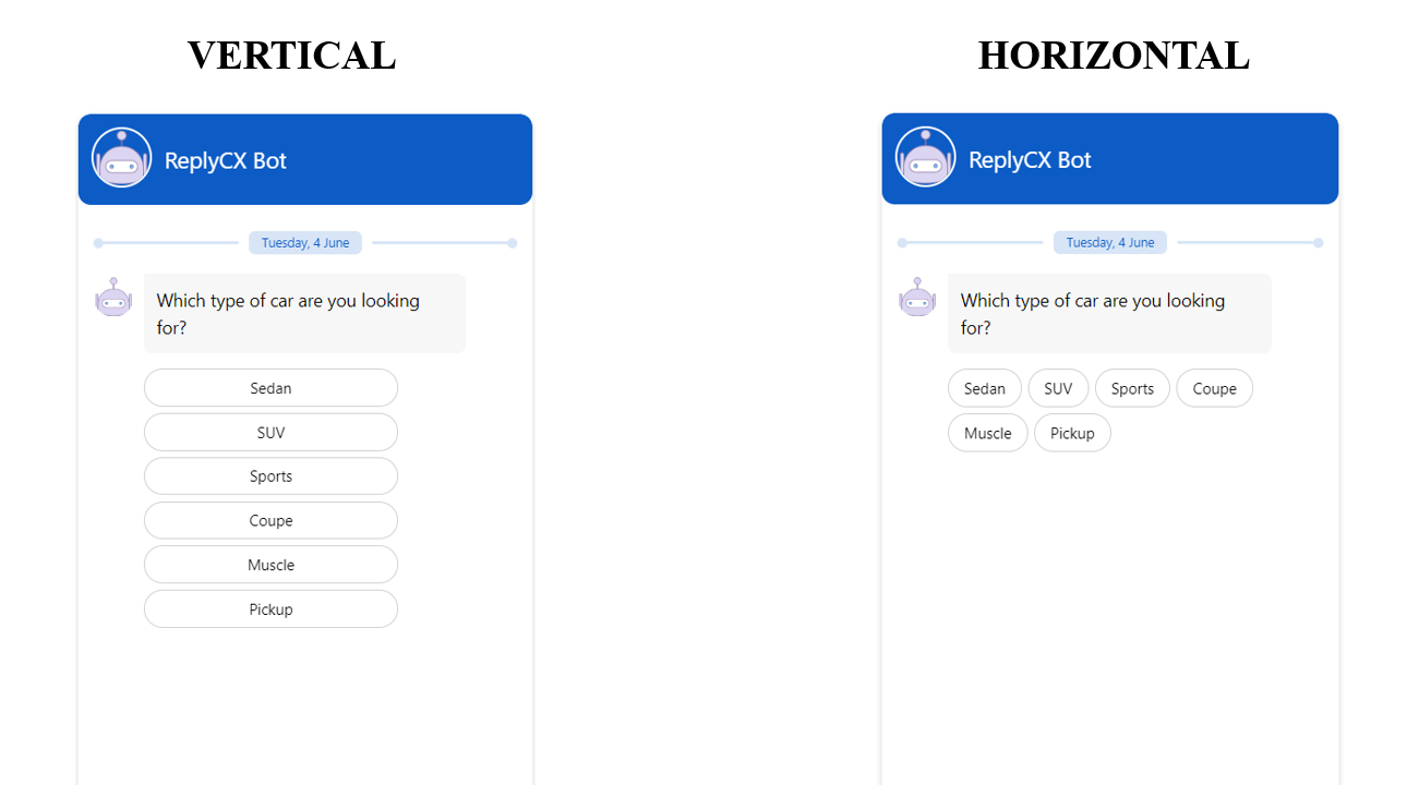
Buttons Layout:
Displays the button in the designated style:
- Horizontal – Buttons are placed side by side based on the available space.
- Vertical – Each item is shown on a separate line.
Buttons Sorting:
You can choose to sort the list of buttons in the following order:
- A - Z – In an ascending order starting from A.
- Z - A – In a descending order starting from Z.
- Random – Button list will be randomized
- As defined – The order as displayed in the action panel.
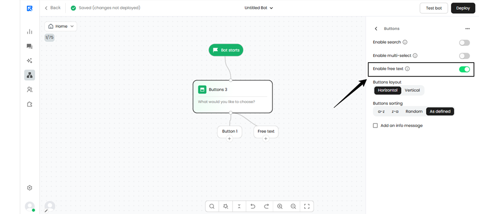
Free text input
When the “Enable free text” option is enabled in the Button block, users can either select one of the predefined buttons or enter their own response directly in the chat input. On the canvas, a new “Free text” node will be created, which can be linked to an AI agent action block to generate AI-powered responses.
This enables more natural, two-way interactions, allowing any user-entered free text to be processed by the AI agent for dynamic and contextual replies.